3D Sign Lettering
Custom 3D Sign Lettering
Give your brand real depth with custom 3D sign lettering.
Depth changes the way a sign responds to its surroundings. Three-dimensional sign lettering creates natural shadow, stronger visibility and a more established appearance on shopfronts, office receptions, hospitality venues and corporate buildings. More Creative produces bespoke 3D letters, flat-cut lettering, built-up letters and dimensional logos sized and finished to complement the surface behind them.
Choose from materials and finishes including acrylic, metal-effect surfaces and painted colours, with options for face illumination, halo lighting or an unlit architectural look. Letter thickness, spacing, fixings and stand-off distance are planned as carefully as the artwork, helping the final installation appear balanced and precise. Templates and concealed fittings support accurate positioning, whether the project calls for one reception logo or a large external sign across a building facade.
Projects showcasing our 3D sign lettering
Take a look through sign projects featuring our 3D sign lettering...
Take inspiration from these 3D sign-lettering projects, featuring a variety of materials, depths, colours and mounting styles. If a particular lettering effect suits your brand or building, let our team know so we can recommend the best way to reproduce it.
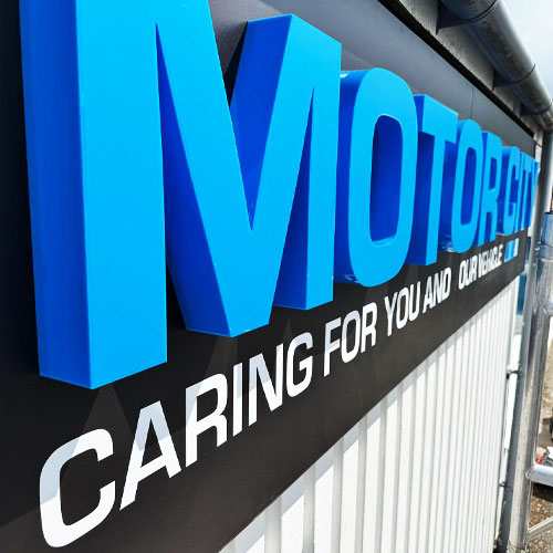
MOTOR CITY ILLUMINATED 3D SIGN LETTERING
Motor City’s illuminated 3D signage combines built-up acrylic lettering with a smart backing tray and integrated LED lighting. The dimensional letters create strong depth and definition during the day, while the illumination gives the branding excellent visibility after dark. Bold, contemporary and professionally finished, the completed sign provides a striking focal point that strengthens the premises and makes Motor City instantly recognisable.
Read more
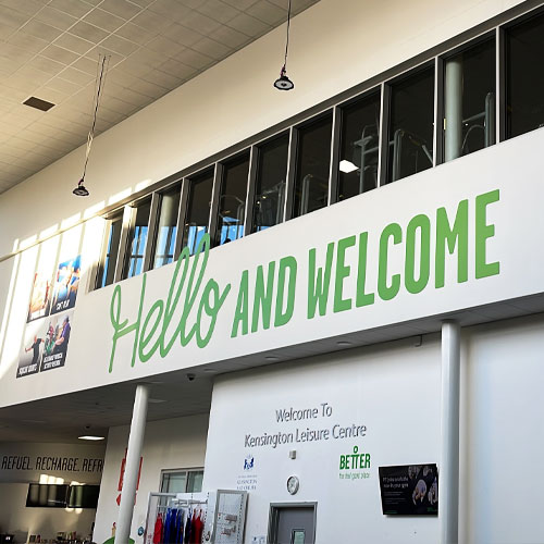
HELLO & WELCOME 3D SHAPE CUT SIGN FOAM LETTES
Oversized ‘Hello & Welcome’ lettering creates an immediate sense of arrival with bold scale and playful 3D depth. Each letter was shape-cut from lightweight sign foam, allowing the message to make a big visual impact without requiring heavy structural fixings. The completed display transforms the wall into a memorable feature and gives visitors a warm, confident welcome from the moment they enter the space.
Read more
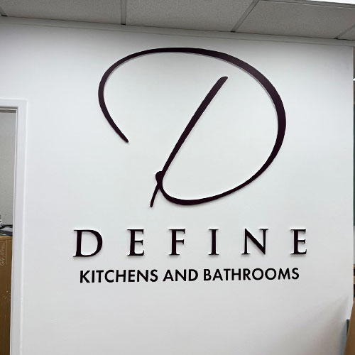
DEFINE KITCHENS INTERNAL 3D CUT SIGN LOGO
Define Kitchens’ internal logo was recreated in precision laser-cut acrylic lettering, giving the branding a clean and contemporary three-dimensional finish. Individually mounted elements form the complete logo with crisp edges and subtle depth, creating a smart focal point within the interior. The finished sign complements the quality of the showroom and reinforces the Define Kitchens identity in a refined, understated way.
Read more
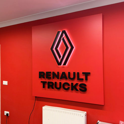
LAUNCESTON TRUCKS SHAPE CUT SIGN PAN
Launceston Trucks’ branding was transformed into a bold shape-cut sign panel that follows the distinctive profile of the company logo. The custom outline gives the design greater character and visual impact than a standard rectangular panel, making it instantly recognisable. Clean, durable and professionally finished, the sign provides a strong branded feature that suits the practical, industrial character of the business.
Read more
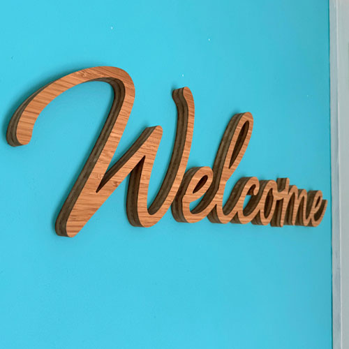
3D BAMBOO CNC CUT SIGN LETTERING
3D bamboo sign lettering combines precise CNC cutting with the warmth and natural grain of real timber. Each letter is shaped with clean edges and enough depth to cast subtle shadows when mounted, creating a distinctive dimensional finish. Ideal for interiors, reception areas, retail spaces and environmentally conscious brands, bamboo lettering offers a contemporary alternative to conventional acrylic or metal signs.
Read more
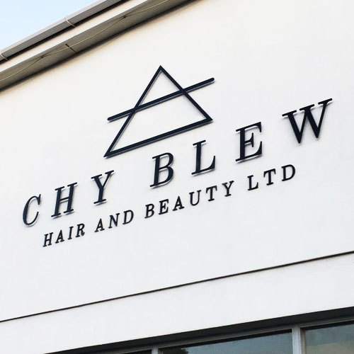
CHY BLEW HAIR & BEAUTY 3D SIGN LETTERS
The raised letters add depth and shadow to the branding, helping the business name stand out clearly while retaining a clean, elegant appearance. The finished salon signage creates a polished focal point and gives clients a strong first impression before they step inside.
Read more
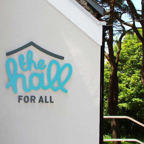
THE HALL FOR ALL 3D SIGN LOGO
The Hall for All’s logo was recreated as a bespoke 3D sign, adding depth and presence to the community venue’s branding. The raised elements create subtle shadow and definition, making the identity easy to recognise while keeping the overall appearance bright and welcoming. The finished sign provides a strong focal point and helps the building feel professional, approachable and clearly connected to the community it serves.
Read more
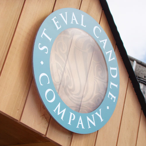
ST EVAL CANDLE COMPANY 3D LOGO PANEL
A bespoke 3D logo panel gives St Eval Candle Company’s branding greater depth and definition within the space. Layered elements lift the identity away from the background, creating subtle shadows and a tactile, handcrafted appearance that complements the character of the brand. Carefully proportioned and professionally finished, the sign forms a refined focal point that feels naturally connected to St Eval’s quality products and Cornish heritage.
Read more
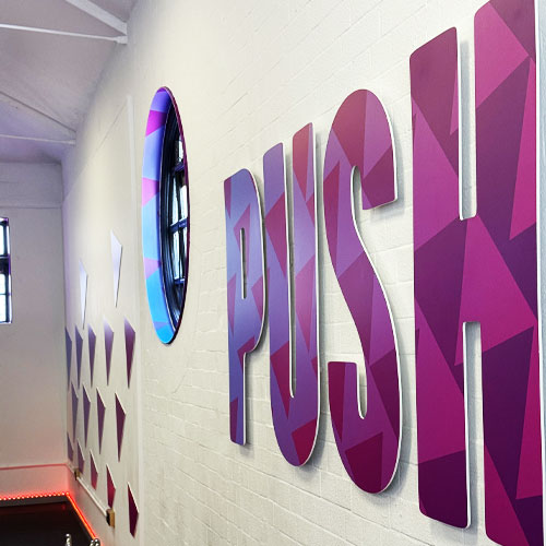
PUSH SHAPE CUT LETTERING AT CHELSEA GYM
Bold shape-cut ‘PUSH’ lettering creates a strong motivational feature within this Chelsea gym. The precision-cut letters give the word depth, shadow and physical presence, turning a simple message into part of the workout environment. Clean, contemporary and easy to recognise, the installation adds energy to the interior while reinforcing the focused, high-performance character of the fitness space.
Read more
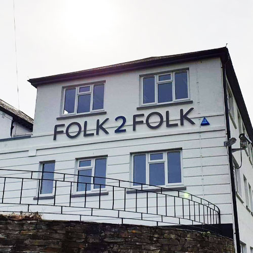
FOLK 2 FOLK BUSINESS 3D LETTERING
FOLK2FOLK’s branding was recreated as crisp 3D acrylic lettering, giving the business identity greater presence within the office environment. The raised letters add depth and subtle shadow while maintaining a clean, professional appearance suited to the financial services sector. Positioned as a strong interior focal point, the finished sign reinforces brand recognition and creates a confident impression for clients, visitors and staff.
Read more
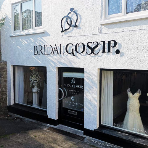
BRIDAL GOSIP SHOP 3D SIGN LETTERING
Glossy black acrylic lettering gives Bridal Gossip in Wadebridge a sleek and elegant shopfront identity. Precision-cut and individually mounted, the raised letters create depth and subtle reflections while standing out beautifully against the surrounding fascia. The polished finish complements the boutique’s refined style, producing a confident and memorable sign that feels perfectly suited to a modern bridal business.
Read more
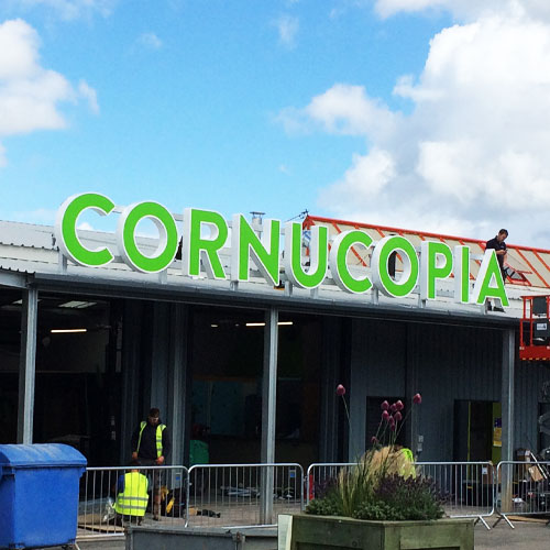
CORNUCOPIA BUILDING SIGN LETTERING
At an impressive 1500mm high, the Cornucopia building lettering creates a powerful landmark in St Austell. The large-scale letters were carefully proportioned to suit the architecture and remain clearly visible from a considerable distance. Bold, confident and impossible to miss, the installation gives the building a distinctive identity while demonstrating how oversized 3D signage can transform a substantial commercial frontage.
Read more
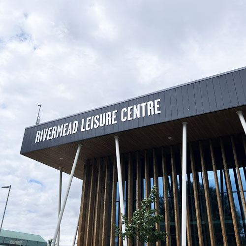
RIVERMEAD LEISURE CENTRE STAINLESS STEEL SIGN LETTERING
Stainless steel lettering gives Rivermead Leisure Centre a clean, architectural identity with excellent long-term durability. The individually mounted letters create crisp definition and subtle depth, allowing the venue name to sit confidently against the building. Resistant to changing weather conditions and easy to maintain, the finished signage provides a premium, contemporary appearance suited to the scale and quality of this major leisure facility.
Read more
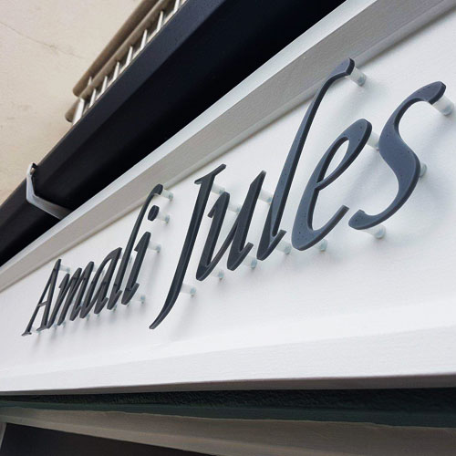
AMALI JULES SHOP ACRYLIC SIGN LETTERING
Amali Jules’ shopfront was finished with precision-cut acrylic lettering, creating a clean and stylish presentation of the brand. Individually mounted letters add subtle depth and shadow while keeping the overall look refined and uncluttered. The completed retail signage gives the boutique a distinctive street presence, improves recognition and creates an elegant first impression that complements the personality of the business.
Read more
Back to Signs Overview
Contact Us For A Free Quote!
Call us directly on 01566 777333 for an instant answer, or complete the form below for a fast response within a few business hours...
01566 777333
hello@